Choosing Colours and Materials for a Timeless English Home
A home feels enduring when its colours and materials suit the architecture, work well in everyday life and remain appealing beyond a passing trend. In an English interior, that can mean pairing a considered palette with natural textures, while responding to the light and character of each room.
Start with the room
Before choosing paint or fabric, notice how the room is used and what is already there. Floorboards, fireplaces, stonework, built-in joinery and existing furniture can all help guide the palette. In a period property, preserving and working with original features may create a stronger result than trying to make every surface look new. In a more contemporary home, texture and carefully chosen details can bring warmth without imitating a different architectural style.
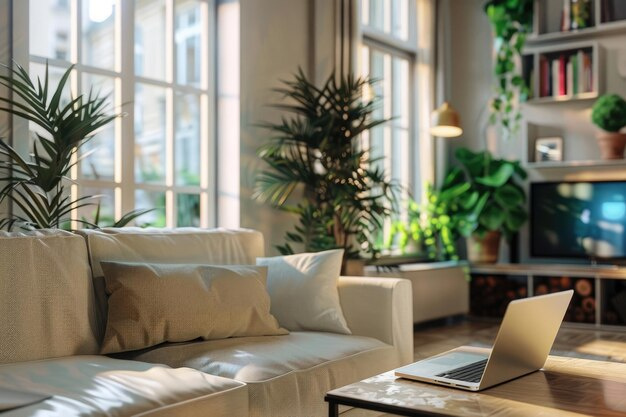
Natural light also affects colour. A paint shade may look quite different in a north-facing room, a bright sunlit space or under artificial lighting. Test samples on more than one wall and look at them at different times of day. Consider the surrounding flooring, curtains and furniture as well as the paint itself.
Build a balanced palette
A reliable starting point is a small palette: a main colour for larger surfaces, a complementary shade for secondary areas and one or two accents. Soft whites, muted greens, earthy reds, gentle blues and warm neutrals can all work well, but the best choice depends on the room and its existing features. Avoid selecting colours from a small sample alone; larger painted samples make it easier to judge the overall effect.
Repeating a colour in several places can make rooms feel connected. The repetition need not be exact: a hue might appear in a wall colour, a patterned fabric and a piece of artwork. In an open-plan space, related tones can define different areas without making them feel disconnected.
Choose materials for touch and use
Natural materials often contribute a sense of depth because their textures and variations are visible. Timber, stone, wool, linen, cotton and ceramic can sit comfortably together when their colours and finishes are considered as a whole. A smooth painted surface beside a textured rug or woven fabric, for example, can keep a restrained palette from feeling flat.
Practicality matters as much as appearance. Consider how a material will cope with wear, spills, sunlight and cleaning in its intended location. A hard-wearing floor may be appropriate in a busy entrance, while a softer finish can bring comfort to a bedroom. Check care requirements before committing, especially for stone, timber and delicate fabrics.
Use finishes with care
Paint sheen changes how a colour is perceived and how a surface performs. A low-sheen finish can give walls a softer appearance, while a more durable finish may be useful on trim or in areas that need frequent cleaning. The right choice depends on the surface and the paint product, so follow the manufacturer’s guidance.
In older homes, take account of the condition and composition of the walls before applying new coatings. If the surface is historic or has signs of damp, seek appropriate advice rather than covering the problem with a decorative finish.
Keep character, allow flexibility
A timeless interior does not have to be plain. Pattern, artwork and personal objects can add character, while a calm foundation makes them easier to change over time. Keep larger, more permanent choices relatively versatile, then bring in stronger colours through items that can be moved or replaced.
The aim is not to follow a fixed formula, but to make each decision work with the home as it is. When colour, material, light and practical needs are considered together, the result can feel distinctive, comfortable and lasting.